Shades of Brown

check your Farrow and Ball colour chart

I am steadily ridding the world of horrid shades of brown. It’s not that I don’t like brown, but I dislike some of its manifestations, which could be named:

Glastonbury 16             Slug            Dysentery           Other end            Disgust

Most of which were in both our UK and French houses in abundance

Our UK home is on an island along with thirty-plus other houses. At the moment the small Victorian iron bridge – the only access to our homes – is being closed at night for repairs and a neighbour asked us all on the facebook page to vote on the colour/s it will be re-painted

The first person said ‘rust colour’!!

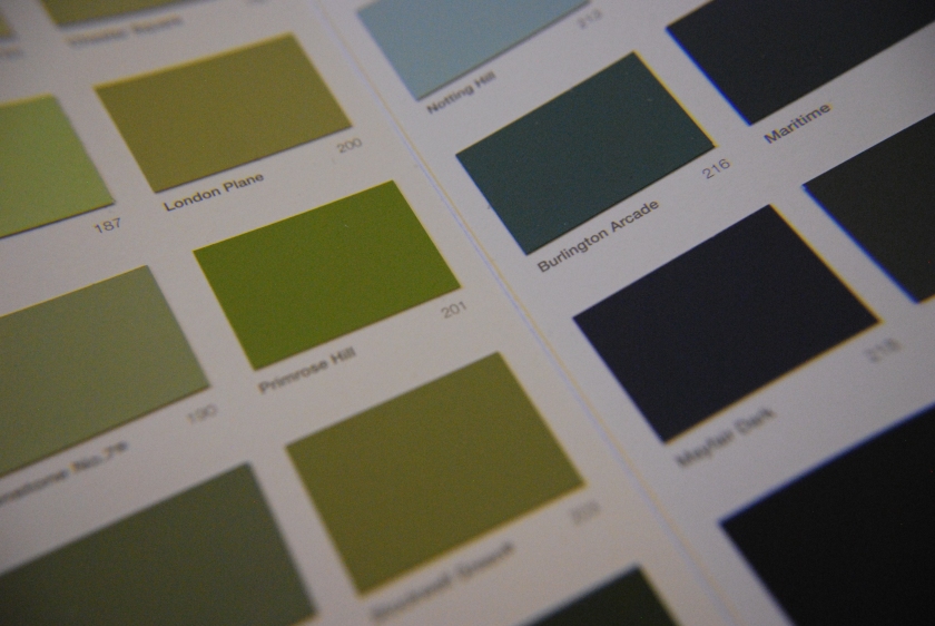
But, rust aside, the two colour schemes favoured are dark and light grey, and blue with white/cream. No-one has discussed the actual shades yet but the population seems split firmly down the middle on this, and I fear another ‘Brexit’ type situation – ‘Bridg-it’ perhaps?

The thing is, people in the UK tend to form a very strong opinion (as we have recently seen) and are polarised in their points of view. I do hope that families on the Island will not be torn asunder by such an important matter!

Personally I don’t think it matters which colour scheme suggestion they go with in name (if indeed we even get to voice an opinion) because surely it’s not whether it’s blue or grey, but whether it’s the right blue or grey, etc that matters

And oh please, anything but rust!


Room with a Temporary View

The sky may be grey rather than blue, but it’s still the sky

In the builders’ lunch area, two large paint pots and a board had been used to create a third seat at the Formica-topped table, and there were thermos flasks, bread, a frying pan and a camping gas stove. They may be the first people to sit down and eat a hot meal here in over forty years

That’s a wonderful thing, a landmark. Life is creeping back into the house

IMG_7923

The removal of the roof began. It’s been windy and very cold but the guys really cracked on with removing the tiles. Almost all the original 17th Century beams are past saving and need to be replaced, which is disappointing, but an essential compromise toward stopping the decay in the rest of the house

IMG_7920.JPG

Seeing the sky come into view (albeit a flat grey that even F and B would struggle to glamourise) through the open roof was a beautiful thing and it reassured me that anything is possible, that we will overcome whatever obstacles we face and rescue this house

But we need to earn some more money first 🙂


Gerty’s Gorgeous Green Gifts

IMG_7735.JPG

After a five month sabbatical, Gertrude has decided to lay again. This is a real joy as her eggs are not only very delicious, but very beautiful too. They have a colour which defies green and a texture that makes eggshell sound way too ordinary. An egg from Gerty is something to touch and to hold, a photo waiting to be taken

The closest colour I can find is Farrow and Ball’s French Gray. Though they are slightly paler, they have exactly the same balance of colours

Once, due to the girls taking meds we were not allowed to eat her eggs for 28 days. At that time she was laying every day so I stockpiled the eggs. They looked amazing as a group, but eventually I threw them out for fear of someone dropping the bowl!

They make a lovely half dozen, don’t they?

IMG_7746.JPG


‘Colour and I are One’

DSC_0012.JPG

‘Colour and I are One’. So said Paul Klee, one of the most exciting artists of the 20th Century. Certainly colour can provoke a strong emotional reaction, and this will be on a daily basis when used in our homes

Blog shots
Castle and Sun – Paul Klee

Like so many people, I pore over colour charts and long to possess the shades therein. Choosing one is limiting, yet I also love the commitment of applying paint to wall after all the preparation

When we moved in to our first flat in Eton it was a blank magnolia canvas, so I indulged myself in reds, yellows and oranges. Baz soon joked that the rooms were becoming smaller due to the number of coats of coloured paint I applied. Then we moved to our little house and when Charlotte was born I painted all the walls in soft buttery yellows to be warm and uplifting. Sixteen years down the line I have replaced pretty much all of this, always happy to have an excuse to re-decorate. Repeatedly. Eventually the novelty wore off and RSI started to set in, and so our hallway still remains unfinished in one corner

I love the brights, but of course there are some wonderfully subtle yet highly pigmented shades, muddied and grounded by earth tones. These have been championed by the rather smug middle-class heritage paint producers, who seem to have plucked them out of an imagined past, charging us a premium for having given them their ancestry and poetic names (‘Elephant’s Breath’, ‘Mole’s Breath’,’Mouse’s Back’ etc.)

As for ‘Cats Paw’? – if I had a cat with paws that colour I would not expect it to come back from the vet…

A member of the family, a professional carpenter and decorator who can recognise the exact F and B shade painted on a wall, tells me that these colours can be reliably matched as trade paints way more cheaply and with higher quality paint, and that when someone asks for a particular F and B paint colour he uses a matched Leyland trade paint and his customers are very happy. So this is something I plan to research. It may be a disappointment, but I have to check it out because regrettably I have to take care of the pennies on the French house. And because it really appeals to my inner ‘Belligerent Bitch’ (which would no doubt be an intense blood-red on the chart)

Does anyone out there have any experience they can share of this matching service?


%d bloggers like this: